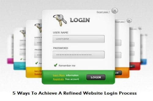
An excellent way to enhance an online experience or to actually make it significant, the most important aspect is simplifying things for the website users. The login process of any website is an important initial process when a visitor comes to your website. A login window that is not impressive and welcoming does not give a good vide about your website to the visitor. There are various things that can be done for improving the login process.
This article portrays 5 important ways for refining the login process.
Before we proceed further, let’s have a look at the types of logins:
Basically, there are two ways with which a user can login to any website. Now a days, a commonly used method is through the use of social networks and you will come across this option for accessing many apps. This method was set up as the app and website owners didn’t want to bother users by making it mandatory for them to registering an account. By logging in through social networks like Facebook and Twitter is a simple process because if you are already logged in, then all you have to do is just click one button, wait for a some seconds until the social networks authorize the connection and voila! You are done!
The second way of logging in is through a username / email address and a password. This is a traditional way of logging in and it can be improved further. The tips mentioned in this article are related to this method of logging in.
Here are the ways for improvising on the traditional method of logging in:
Enable Email Logins
It is perfectly fine to sign up with an email address and password. It is natural to use email for logging in. it is important that you enable the users / customers to use both, the username or the email address and the password for logging in. I have come across logins that accepted both but only necessitated the user to use the username as the main input. According to me, this is a flaw in the design.
People might not always remember the username as they generally use the same email address to login at different places but the username changes. Not providing with email login access is also one of the web designing mistakes that reduce the efficiency of your landing page. Therefore, allowing login with both, the username and the email address takes care of the user’s convenience.
Display Clear Error Messages
When it comes to any website login, it is important to detect whether or not you are providing a user too much information or not enough information. Too much information can allure the attention of a hacker and too less information might confuse the visitor.
There are robotic errors like ‘Invalid Input’ are not at all helpful. It is important o display the errors in simple language.
If you want to improvise on the login experience, make the use of JavaScript to help the users and to validate some information. For example, typing ‘.con’ on a smart phone device instead of typing ‘.com’ or not having a period at all. Before clicking on the submit button or doing the whole thing again, you must let the users know ahead of time. This makes life easy for your users and also saves their time.
Add A ‘Forgot Password’ Link
Although this is an obvious thing, it is overlooked by some of the websites. The users need a link to retrieve the forgotten password and the same holds true for the username as well. Make sure that this link is vividly displayed, don’t hide this link and don’t make the users jump to many places on the website before they find this link. Have it ready! The ‘forgot password’ link should not be the predominant thing on the page but it should stick around perfectly.
Disturbance-Free Login
There are two common methods or creating a login setup, t might be a pop-up window on top of the page or it can be the login page itself.
There are many advantages to having a login on a single web page. If you want to do this, keep in mind that there should not be any disturbances around it. You need users to be logged in to their accounts first and then you can display the promotions or any other stuff. It becomes easier to sell when people are logged in.
Here, it is also important to bring up the point of conversion or retention. With fewer distractions, it becomes easier for the people to log in and it becomes easier for you to up-sell to them. This approach works for sign ups and checkout forms as well. The loading speeds are good as there are fewer items on the page to load.
Assigning Labels Is Important
Whatever you do, do not label the submit button as ‘submit’, use ‘log in’ instead of that. As a result of this, people understand and expect specific things in order to submit the form. This enhances the overall experience and it can go a long for you. Avoid the use of placeholders for the input titlrs. The best option is to use an input label. Do not forget to specify that the email address or the username can be used for logging in.
Conclusion
Above mentioned are 5 efficient ways to make the login process more functional and refined. After implementing these steps, users will be able to access their accounts smoothly and this will alleviate the overall browsing experience as well.
It’s all about simplifying things and making them better!


