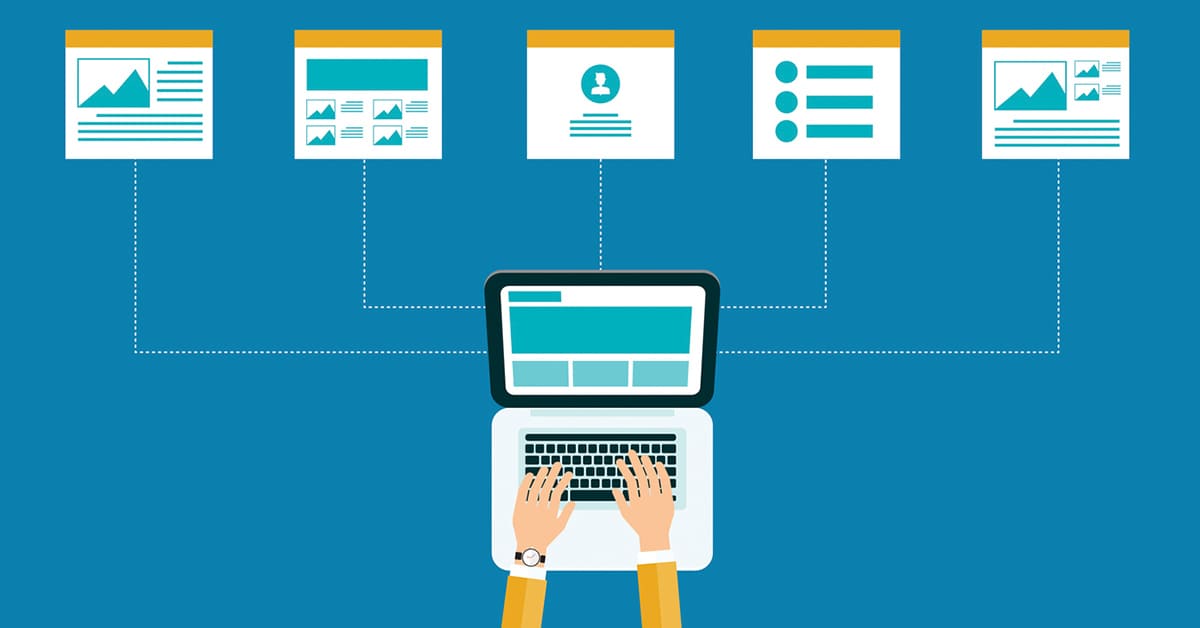
A large website comprises of many small parts that need to be beautifully put together in an organized way, in a way that is useful for the website users. Within just the first 5 seconds of landing on your website, new visitors decide what you do, what you sell and what is your website all about. While designing a website, you need to answer these questions:
- Can the users easily find how to navigate to the blog and other important pages from the home page?
- Is the layout of your product/service pricing easy to understand?
- Does your website have a high bounce rate?
A perfect website goes beyond the design and content; it is about having a design that creates user experience, ensures functionality and displays appropriately arranged elements that are connected to each other.
So, let’s get to discussing about what do you need to make your website easy to use and impressive at the same time!
Organize The Link Hierarchies
It is a good idea to categorize and sort the links present on your website. This makes it easier for the user to navigate to the right web page within your website. You can organize the links in some space within the website or you can organize them in the footer. For your website’s home page footer and for the footer of all the pages, it is advisable to mention the links of the website. You can consider adding the most popular posts and categories from your website’s blog in various columns or you can organize smaller or less important page links that cannot be shown in the top navigation of your website.
It is important to ensure that you use titles and headings appropriately for organizing all the links so that they are easy to browse.
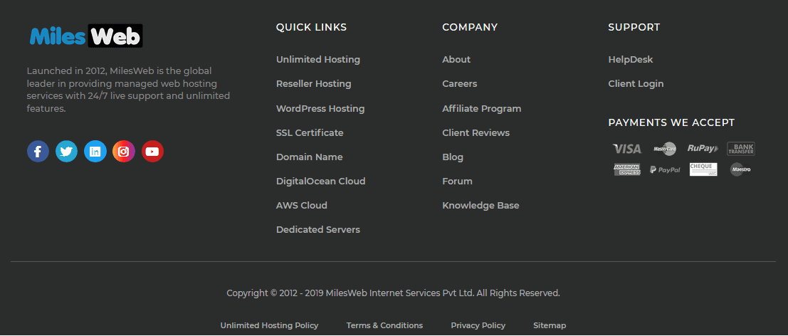
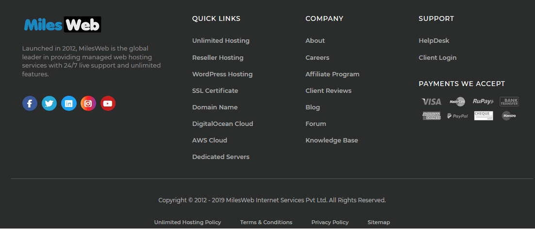
This footer splits into multiple columns mentioning the important links of the website. This is an ideal user-friendly minimal design that simplifies things for the users. Make sure that you do not mention too many links as they might confuse the visitors. Moreover, using the right color combination is also very important.
Change Your Home Screen Banners
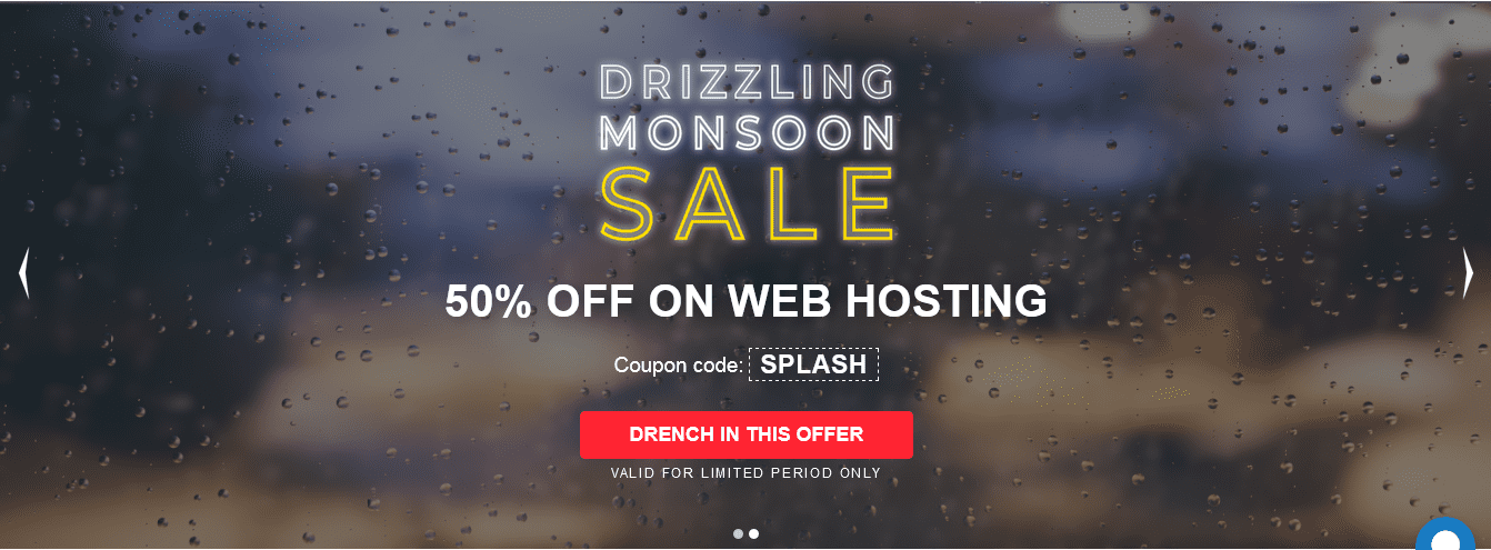
You might be having a beautiful picture as the home screen as your website’s home screen banner. The home screen banner of your website is the one that greets the people who come to your website. Therefore, if there is an occasion or a festival, people need to see it on your website when they visit it. For instance, if you are running some offers for the new year, it must be shown on your website’s home page banner as well. Doing this will help people to relate with your website and the festive emotion will also be intact.
For instance, during the monsoon season MilesWeb’s home page looks like this:
Ensure Website Speed
If you have a large website there are chances that the web pages might hang or freeze while people are browsing them simultaneously. It is important to ensure that your website speed is taken care of by backing your website with a powerful web hosting server. For a medium or a large website, you can opt for VPS hosting, cloud hosting or dedicated hosting. An efficient and appropriate web hosting platform will provide your website with the necessary resources and will make sure that your website doesn’t become slow even during the high traffic times. It is also important to secure your website by installing an SSL certificate. An SSL certificate helps in encrypting the information transmitted between your website and the server and it is important to have it installed on your website if you are dealing with critical customer information. A fast and secured website will provide you benefits in terms of search engine rankings as well.
Navigation Within Website
How people move within your website is an important point to be considered. There is nothing bad than a website that has a disorganized or a confusing website navigation. When you put up internal links in your website it is important to ensure that the customers are quickly and easily able to find what they are looking for. It is crucial to have navigation hierarchy, streamlined content and a responsive website design in order to provide a favorable browsing experience to your users and customers. Check how your website works on mobile and tablet screens, if it looks distorted, it’s time to work on that! if you have an ecommerce website, people are most likely to browse it through their mobiles. It is a recommended to create a mobile website for a profound browsing experience. When someone visits your website, they have something in their mind that they would like to look for and if they are not able to find it on your website; they wouldn’t wait for a long time. Not having a good internal navigation will also result in an increase of your website’s bounce rate.
Get Found
Work with keywords on your websites. Your website design must have keywords that help you to get found. This starts by creating an SEO strategy that comprises of the use of keywords that your buyers and your audience might use for searching for websites related to your industry or niche. Your SEO strategy must also include creation of content that is relevant to the needs of your buyers and visitors. You can create content in the form of blog articles, infographics, e-books, white pages and videos. While doing this, don’t get overwhelmed with the endless keyword possibilities that you need to rank for. What you have to do is identify the proper keywords that your audience is actually looking for.
Use Colors To Attract Visitors Attention Towards Call To Action
You might have placed many call to action buttons on your website but if you are still not getting the right response, something needs to be changed. It is important to use colors wisely on your website. Colors have emotional connotations. Use of an appropriate color scheme provides you with an opportunity to attract the visitor’s eyes towards the call to action buttons. Use of contrast color is great when it comes to alluring the visitors. Consider the following points while deciding a color scheme:
- Use a different color other than the background for a call to action button.
- Contrast the button color and the button text color.
- make sure that the button color is different from the other nearby elements of the page or you can have some white space around it.
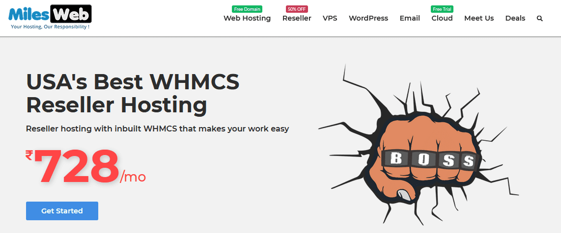
Check out the color scheme used on MilesWeb website, the call to action button is clearly visible. This is a simple use of colors that won’t confuse or intimidate the users.
Be Careful While Linking To Other Websites
It is understandable that at times you might have to link to things that are favorable and useful for your website visitors. in case of a blog post, you often use a citation or some external link source. But while linking to other websites on your website pages and your home page, you must be very careful while linking to other websites as you are passing on the link benefits to them as well. When placing any other website link on your website, you need to ask yourself if you really need your visitors to see this link? does it help your website? Place other website links only of it is inevitable or extremely important.
Avoid The Use Of Social Media Icons On Your Website Header
It is definitely important to have social media icons on your website but having them right on your website header is not a good idea at all. These buttons are colorful and attractive but if any of your visitors happens to click on them then the visitor will land on a social media website that might distract him/her. once navigated to a social media website, the visitors are unlikely to come back on your website. The right approach is to place the social media buttons on the footer of your website. once the visitors are done browsing your website, they might think of connected with you on the social media websites. For instance, here is MilesWeb website’s footer through which you can connect with them on the social networks.
Go With Standard Layouts
Weird or complicated is not usually pretty! The truth is that a website that follows a standard and a clean layout is more likely to be loved more. The websites that are considered to be more beautiful and favored are high in phototypicality and have low visual complexity. You might think of differentiating your brand by using a different design or by arranging your website element in a different way but this won’t help you if the layout confuses the people.
Be different in what you say not how you say it!
So what is a standard layout? A standard layout consists of the following aspects:
- your brand logo in the top left
- horizontal navigation in the website header
- Search bar present at the top
- Social media icons in the footer
- Mobile responsive design
- A decent and impressive color scheme
Avoid The Use of Long Content Paragraphs
If someone wants to quickly glance through your website, large content blocks are not going to do any good. You might want to mention some very important points but it is ideal to break them and use them as pointers or small paragraphs. This helps in enhancing the readability. As a thumb rule, avoid writing paragraphs longer than 3-4 lines. if visitors see big content blocks on your website, they might not be interested in reading them and the important points that you want to portray on your website might go unnoticed.
