“Content” – Anything you see, write and read is called as content. It is available in several forms such as text, video or image. We all come around these forms of content daily.
In the world of web or internet, “Content is the King”. This is because content plays a key role in terms of engagement on the website. Website owners are always giving a keen attention towards their content. They make sure that the content they post on their website or social media platforms or some other sites, helps people to stay engaged. This boosts their website traffic.
How to determine if the website content is interesting or not? It completely depends on the reader. If your website content engages, informs and entertains the reader to grab his attention and takes him via the marketing funnel then you have a great content. Website content comprises of short, graphic-heavy infographics to in-depth data-driven whitepapers. It doesn’t matter at all, what kind of content is being produced. Instead writers need to keep some pointers in mind when writing the content for a website.
Content Before Website Design – Why?

Planning for a new website or thinking about redesigning your current site? You might be happy and excited but nervous at the same time. This is because you are quite impatient to see the way things will work together and the first impression you will make on your website visitors.
You will have a good chance of being focused completely on your website design and forget about something that has similar importance in the process: the content.
You can’t have a well-designed website without the content. But a website with incredible content can’t be perfect without the right presentation. These two factors are essential for a successful website, that offers high levels of user engagement, conversion rates and search engine rankings. But have you thought upon what should come first?
The debate on the content vs design can’t be solved simply by saying “design a best site and then write the content to fill in it.” You can go both the ways but there are some pros and cons of them which we will check below.
Related: How To Create A Website When You Are Not A Website Designer?
What is the Problem with the Design-First Method?

In case you are creating a new website, you will be focusing on the outward appearance prior to the content which means you will create a beautiful theme, skin or layout and then work on the text, photos and other information that is going to complete it. At first, this approach will make sense, specifically for the brand new sites. How will you know about what kind of the content needs to be produced, if there isn’t any navigation or layout available to guide it?
The big problem with this method is that people won’t be significantly remembering the design of your website. Spending your time and budget on your site design or creating “boxes” for content where you will just place it into later, you are getting yourself ready for several headaches.
Things People Remember About Your Website
Do you remember the last website that you visited while you were finding something? What was the first thing you noticed and still remember about that website?
Your answers would be something as below:
- “It was perfectly the same what I was looking for.”
- “It was interesting.”
- “I liked this feature.”
… or this:
- “Found it difficult to navigate.”
- “The popups were annoying.”
- “I didn’t find what I wanted.”
As per a study, it is found that 37% of total customers will abandon your website in case your website layout is unattractive or very difficult to use. Also as per the Baymard Institute’s research results published on Smashing Magazine, people abandon the shopping cart, if they don’t find the products they are looking for. Though from this data some of the issues were considered to be minor, others displayed several flaws in navigation, product photography and organization and the way these elements worked together. People seemed to remember these flaws which unbalanced the website’s content and design and offered a bad user experience.
Check the below important note made about the IKEA website:
While testing, the subjects were surprising that a website wasn’t simply linking directly to all products displayed (in product photography) but they needed to find them down to learn more or to buy them. This had a negative impression of the website on visitors and some thought that even the owners haven’t clearly used their own website.
Many times you first laugh and then cringe. This situation arises when the design is planned prior to the content, means images are added prior to the navigation or vice-versa. IKEA didn’t think about what the photos will contain. Therefore, they hadn’t planned about adding “also in this image” product links which gave rise to confusion, frustration and even loss of revenue. This is what people remembered. So, it isn’t a good thing for the one that visits your website.
This is one specific reason that you shouldn’t plan your website design and content separately. Instead, you should plan your content at the same time when your website design is underway, though you can’t create it immediately.
Why Should You Produce the Content First in the Process?

Don’t think of me as a professional who will write your website content or design your graphics prior to seeing a mockup of your site. But I would recommend you to plan on including content into the starting stages of the design process, rather than making it a “last stage” event. Below are the benefits of this:
- You don’t need to produce SEO content at the eleventh hour when the site gets launched.
- You don’t have limited spots and spaces for the content as you didn’t think about it while approving the design.
- Your site designers have read and even are impressed by your content.
- You will be able to add content while the site is being designed, so that correct size and length of text gets filled in (which can help decrease the time necessary for testing or changes later).
These benefits should help you integrate your content creation in the earlier stages of your website development.
This content isn’t just limited to webpage copy that is written mostly for SEO purposes. It can also include elements such as downloadable guides or whitepapers, product descriptions, promotional graphics, calls to action, product photography, blog posts, long-form content, and much more
To ensure this to be done, here are a few ideas:
Ways to Integrate Content Production Into the Design Phase

When you have a dedicated team and you are an organized person, just saying “make sure the content gets ready by this day” would be enough. But having a tool or reference piece to keep all on the track won’t hurt you. Here are three ways you can ensure if your content production is being done as decided.
1. Create a Roadmap
Prior to setting specific deadlines for your design or content, it is important to have the basic idea of generally when you need to complete it. Rather than randomly planning for due dates, it is better to work with your team mates and create a roadmap for the website design process that can be followed as a group.
You can create a specific or indistinct roadmap that contains many or few steps. There is just one goal: launching your website. In this, you should plan for stages and dates that are important to you but different for all along with other significant events. Below is an example of the roadmap:
You can ask yourself the below queries, to create your own web design roadmap:
- How many times should I plan to review and change the planned design?
- What is the amount of new content being created?
- What existing content assets are already available? How will they outline the design of the site?
- What should the web designers see content-wise, to produce a website that satisfies both SEO and users? (For example, in case your designers don’t know that you need two paragraphs of text on each product page, they might not give you the right appropriate space for it.)
2. Use a Project Management Solution
There are several affordable, reliable project management solutions that can be used to collaborate with your team on your web design project and keep everyone on track. Generally, project management software is offered in the form of web-based software for easy access, and gives you the ability to allot items to individual users, communicate directly with your team, check in ongoing progress, and also work together on files or brainstorming sessions.
Different from the roadmap, a project management solution will allow you to set accurate deadlines, and describe important details that you don’t want to be missed. You can surely use both, or just depend on one.
3. Set Up Checkpoints and Schedule Reviews
Not all teams are the same. You might need to meet your team weekly based on the size and scope of your website design project for knowing about its progress and resolving any queries or concerns regarding it. In case the project is progressing at a faster rate, you might need to go for daily meet-ups. It is best to define some checkpoints at which you being the decision-maker will sit down and make sure that all is progressing in the way it was planned.
Though you are using a project management solution and guided by a roadmap, sometimes an old-fashioned team meet-up is always the best way to resolve issues and keep all on the same page. But, it won’t be significantly right to depend just on meetings to track your progress. It is difficult to keep your team organized without a calendar or setting a due date.
One of these suggestions, or all three can be used to get your content produced at the right time, and to smoothen the overall design process.
Even Design Can Guide Your Content

In the argument of which should come first: website content vs. design, there’s one more thing to be noted: in reality, it’s impossible to plan for each piece of content, you will need when your site is designed. There are several situations that can come up while your website development is in process that you won’t be able to predict, right from the need for a new page to complete a part of your navigation to a brilliant, mid-design idea. So, your site design can actually help your content, and when both come together, you may think that there’s a need for something you could never have seen before.
Be alert while your site’s design progresses. Similar to the IKEA example mentioned, you might probably have to see those final product images prior to knowing some “also in this photo” content will be required, or that your navigation will need to be updated to adjust more than one product displayed on any given page. There are always some last minute changes happening, so allow your design to direct your content decisions where required.
Related: 10 Great Web Designing Tips For Large Websites
Content – The Most Important Thing on Your Website

The Value of Website Content
Having an interesting content is what makes your website to stand unique from the masses and delivers the right message to your customers. Content determines your website’s success. This means content wins the pockets of your customers. Other components such as design, visuals, videos, etc. just play a secondary support role. If your taglines are effective then great designs will just enhance their effectiveness. Just the design won’t help you to sell. Your website content needs to always start with proper market research.
Finding high value customers and defining roles for your website is what come first. Next step is to find ways to target the customers. Customer-centric taglines and slogans are significant to drive the attention of your prospective customers. The taglines need to deliver a clear value proposition and comprise of effective call to action. When your website has clear, relevant and keyword-rich content that conveys the correct message with energy and conviction, it is always successful. Your website content should target your audience, engage them and convince them to take the action.
Copywriting vs. Copyrighting
As you know that good content plays a key role in your website’s success, you should hire a professional copywriter for delivering professional copy for your website. Copywriting is the process of writing professional content for marketing purposes. Don’t confuse it with copyrighting in which a copyright or a legal protection is obtained for your unique content. It is the best to save both the services. This is because after spending on professional copywriting, you should copyright it with the Patent Office. You may also file for trademarks for some of your successful slogans and taglines.
Videos and Other Visual Content
Content just in the form of text isn’t effective. Placing videos on websites is changing the way of communicating important messages. Website visitors expect to get the required information effortlessly. Custom videos can engage audiences greatly and convey important messages in a format that needs less effort instead of reading large amounts of text. Additionally, illustrations, infographics, diagrams and interactive presentations make it easy to explain difficult concepts and help users in their decisions.
Importance of Website Content

Good content increases the number of people who search for your website via search engines. Search engines love content that is frequently updated and in case, you want to get people to your site, it is important to offer the content that people are expecting to see. At the same time, search engine needs to find the content for their customers.
Consider the below things:
Determine the number of pages that offer your company’s products and services on your website in detail. These pages might be limited.
In a blog, for instance, you can add fresh, relevant content virtually every day. Each additional page of content is potentially a new entry point (landing page) for your website.
There are several companies that have close relationships with their customers. It is sensible to post relevant and useful information on your website in the form of articles, blog posts or whitepapers. Due to this, your prospective customers get a chance to see you as an expert in your industry and are more leaned to conduct business with you.
In content marketing, you build trust while communicating with your customers and also develop credibility in the process.
Discover the Golden Rules to Write Website Content

Internet is a crowded space but saying this is similar to saying that there are lots of stars in the sky, atoms in a cell or sand on the beach. As per Internet Live Stats, over 1.7 billion websites exist and over 3.5 billion Google searches are done every day and approximately over 3.8 million tweets sent every minute.
It is a challenging task to capture readers’ interests in this expanding digital universe. As per the study from analytics service Chartbeat, 55 percent of visitors spend 15 seconds or less than that on a web page.
In order to beat these stats, good website writing is required. When a well-written content is optimized for the web, it is seen to be on top in search results and grabs readers’ attention.
There are some writing tips that apply despite of whether your style appears on screen, in print or carved into a pyramid wall. Other tactics are especially applicable for digital scribes. Check these 11 golden rules to ensure your website gets the attention it requires.
1. Find Your Audience
Simply speaking, several writers start writing on paper or typing on the keyboard prior to thinking about their audience. Prior to drafting content, don’t miss to ask these questions: Who is the primary audience? What about the secondary audience that can influence and inform your primary audience? How will they find your site online?
For instance, you are creating a law firm’s website. Your primary audience might be the existing clients. But when it comes to your secondary audience, it might be much broader and can include other law reporters, attorneys, or anyone who might require your services in the future. It is needed to check if your content is accessible as well as interesting to all these audiences. Knowing the types of questions these groups ask about a particular topic, the online platforms on which they are most active and the kind of information they need, is quite significant.
The audiences get the content via several different paths – links from other websites, social media sharing, email sharing and search engine results. The last method is highly important when you write for the web. Text should be well-written and informative but if it isn’t optimized for search engines, only few people will find it. Rethink about your audience and check for the search terms they might type in Google. Then include those terms in headlines as well as sub-headers.
2. Make Use of Short and Simple Sentences
Long sentences are for Charles Dickens (an English writer). Today, short sentences of 35 words or less than that are demanded by the readers. As per the Organization for Economic Cooperation and Development, 50% of American adults can’t read a book at an eighth-grade level. Therefore, for your content to reach a wider audience, your website content must be accessible and easy to read.
Concentrate on using nouns and verbs; use adverbs and adjectives carefully. Ensure that you don’t use words such as “equanimity” or “obfuscate” when words like “calm” or “confuse” can work there.
In case, you aren’t sure about the grade level that you can write at then it’s better to check the way your text scores on readability models.
Several popular models are based on the length of words and sentences in a text. Your text’s readability score is decided by a number or an education level. Below are the three tools that will scan your text and show your readability score:
- The Readability Test Tool
- The Readability Calculator
- Microsoft Word
3. Post the Content in the “Inverted Pyramid” Model
While reading on the internet, readers have short attention spans and so, they will know whether your site has the information they need within seconds. Hence, it is important to build your content such as an upside-down pyramid or cone. It means the most important messages should be placed at the top of the page and then, below there must be more specific, supporting information. Basically, it means end with divergent details.
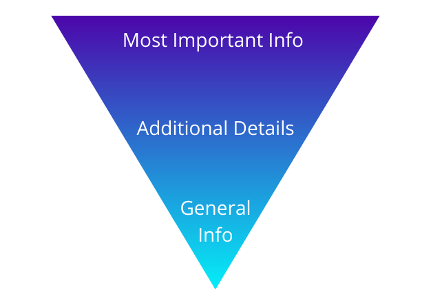
Let’s say you want to create a webpage about a conference. The most relevant details such as date, description of the theme and location will appear at the top of the page. While other supporting details like speakers and their lecture topics should then follow. Then should come the less important information including the history of the conference series, conference organizers, or a list of related resources at the bottom of the page.
4. Try Using Active Voice Only
Ensure that you always use active verbs, avoid using passive verbs and mention the subject of the sentence. For example, instead of writing “A coffee was ordered,” write “The man ordered a coffee.” Or instead of saying “Clothes can be ordered on our website,” say “You can order clothes on our website.”
Due to active voice sentences become concise and reader-friendly. It appears to be more direct and engaging while speaking to the audience.
5. Avoid Jargon
Not just technical experts but also common people use the internet. Therefore, it is important that the information you post can be understood even by an educated non-specialist. Make use of acronyms on first reference. Don’t use hard language and explain the complex or niche terms. Ensure there are hyperlinks used to other articles where readers can get detailed information on a certain topic.
Check the below sentence:
The new technology introduced by the company is a game changer for the audience.
Here many of you would take game changer as the technology that will change the game but the actual meaning in simplified format is as below:
The new technology introduced by the company will benefit their audience.
This tip is important if you work in a technical industry and want your website to engage non-expert customers. Don’t forget that you need to write for your audience (as in rule #1) and not for your colleagues. When you use accessible language, it will help you represent as friendly and open, just what you want to deliver to future customers.
6. Show, Don’t Tell
Don’t use general and high-level statements. Using specific, real-world examples help readers to better understand and visualize your messages. Consider the below descriptions:
This is the best web hosting you can buy.
Or
Our servers are configured with Intel Xeon processors, SSDs and hardware RAID 10 that offer the best performance for your website.
You can see that the second description gives you a complete idea about the web hosting you are buying.
Additionally, when you write specific, descriptive product information, it helps to improve your website’s SEO and gives customers in-depth information about the product to make purchases.
7. Mix Up Your Word Choice
Words can be considered as chocolates and we have some as our favorites. When you want to keep your visitors interested, variety is needed. You can use word clouds which can help you get the variations of words by thinking which words you use frequently. There are several free word cloud tools available where you just need to copy and paste your text to generate your cloud. The frequently you use a word, the bigger it will appear in your cloud. Even sites such as Thesaurus can help you find synonyms of the words to enhance your text.
Don’t miss to check your website keywords too. Those should appear several times in your text, so they can be easily recognized in a word cloud.
Here’s the exception: Maintain the consistency of key terms across your site to avoid confusing your visitors. For example, if you’re a web hosting provider, don’t mention “web hosting” on one page then call it as “shared hosting” on the next.
List down the terms that describe your company and combine together any words you use as synonyms. Select the top ones and use them everywhere on your website. Check below:
Use: invoice
Not: bill
Use: web hosting
Not: website hosting, web host, etc.
Do you call your customers clients or users and refer to services, packages, or plans? After getting this list ready, you can use it to analyze any text prior to publishing it.
8. Incorporate Multimedia
Many times a picture or infographic or video really is worth a thousand words. As per a research 90 percent of the information transmitted to the human brain is in visual form, and humans process visual information 60,000 times faster than text. When you use an easy-to-read chart or graph, it can explain a complex topic easily instead of text alone. Though you aren’t a graphic designer, you can use visuals on your website in several ways by using some tools such as Canva and Piktochart.
With images, text can be reduced making your page easier to read. It is recommended to have at least one image on each page of your website.
9. Make Text Scannable
Along with including the most important information on the top, ensure that the text is easy to scan. Several web readers scan the page for some specific information and in case they don’t find it easily, they move on.
If you don’t believe it, pay attention the next time you open a webpage that you haven’t visited before. Check if you read every word from the start to end? Or you are simply finding for the information you want?
- Instead of paragraphs with only text, use bulleted or numerical lists. You can also organize content into labeled tabs.
- Don’t miss to include “white space.” It means the empty space around the paragraphs, images, and other elements on your web page. You may think it as a wasted space but it is actually beneficial for a web designer. When there is good amount of white space around text, it makes the text more legible and enjoyable to read.
- Dividing content into sections with descriptive sub-headers is also essential. For example, a webpage about web hosting might contain the information under the following headings:
a. What Is Web Hosting?
b. Benefits of Web Hosting
c. Types of Web Hosting
d. Start a Web Hosting Business
e. Learn More
Due to these sub-headers, readers can navigate the page and search engines can find your content.
10. Let Them Crave for More
Below is an example of what a call-to-action button can look like on your website.

You will find a strong call-to-action (or CTA for short) at the end of all good websites. What if the reader requires more information, whom should he contact? Is there any interesting video they should watch? Is there any related blog post they can read or a report they can download? With this strategy, readers can get directed to other areas of your website and it can encourage them to promote your content to their friends and family.
Ensure these calls-to-action are short, and start with action verbs like “Download,” “Share,” “Join,” “Sign Up,” “Learn More” or “Watch.” And of course, don’t miss to include a hyperlink that actually enables readers to complete the action you’re asking them to take.
11. Layer Website Content
A website can direct readers from one page to another and this is the great thing. Your website can help readers to find great content by hyperlinking some keywords or phrases to other relevant resources, significant those on your own website. With this people will stay engaged with your content and navigating your site.
For example, if this sentence appeared on your web hosting website: WordPress hosting is the best hosting for bloggers. You can hyperlink “best hosting for bloggers” to a blog post related to WordPress.
When internal links are built within your own site, it also helps your SEO, but ensure that links should always be relevant and helpful. If you overload your text with links, people won’t understand what to click on. Google recommends keeping the amount of hyperlinks on a page to a “reasonable number.”
What are the Important Pages to be Included On Your Website?
After planning to develop a website, many of you face a query that what pages should your website have? This is quite a common question among online entrepreneurs and small business owners when they are developing their website. Here is the list of the most important and significant pages your small business website should have.
When thinking about the content creation for a new website, each business is unique and wants to stand different from its competitors. But visitors of your website always set their expectations about what information they expect to find on it and where on your website they expect to find it. For finding out which content pages to develop, check below the questions that you should ask yourself, or ask your content writer:
- What pages should be included on my website?
- What type of content should I post on the homepage?
- Is it important to have a privacy policy page?
- Should my website have a testimonials page?
- Is there really a need of a company blog?
- On the “about” page, should I mention about myself or the company?
While creating pages for your website, there is a set of standard or general web pages which all small business websites should have. Check below the list of most common pages that every website should have, and the type of information these pages should feature and include.
Home Page
Your homepage is the first page viewed by your visitors and so, it should tell everyone who you are and what your company does. I would say that your homepage content should be captivating enough to gain the attention of your visitors within seconds. Ensure that your homepage is well-designed, loads fast and looks professional. As per some studies, you have 0.05 seconds to convince people to stay on your website.
What to include:
Just include a short description of who you are and what you do then briefly explain your services and products, and perhaps add some bullet points on how you can help your potential customer or client.
About Page
A business is between people and visitors are keen to learn a bit more about who the people are that run the company. The about page is often one of the most visited pages on any website. Therefore, you should include a brief summary of who you are, your company history and how you are different from the competition. Take a look at MilesWeb’s About Us page.
What to include:
Start with a summary of your company, whom it employs (with biographies and pictures of each staff member, or just yourself if you are a sole owner), any special achievements you received, and the ways you differ from others offering the same product or service.
Services Page (if you offer services)
On this page, you can list details about the services you offer. Start the page with a summary of your services before outlining them. In case your services are vast and their descriptions are quite extensive, it is better to divide them into sections, as well as add a link to a landing page, where readers can get more information about a particular service.
What to include:
A snapshot of services presented, bullet points of services with short explanations, links to learn more about your special services (if you desire), the benefits of using your services, and how they differ from the services your competitors offer.
Products Page (if you offer products)
On this page, you can describe your products in details. Start the page with a short summary of your products prior to listing them. In case of multiple products and extensive information on each product, it is better to divide them into categories and add a link to their product pages.
What to include:
So, include an outline of products available, short descriptions of each product, links to product pages for more information, what benefits the customer can gain by purchasing those products, and why customers should buy those products from you, instead of your competitors.
FAQ Page
On the FAQ page, you can answer the most frequent questions asked by your visitors /customers. The frequently asked questions (FAQ) page will let all know – on one page – what they need to know. Due to this page, your time for answering those same questions on an individual basis will be saved. Ensure you post honest answers for each one.
Note that your answers will act as a call to action, and convince a potential customer to take the further step and buy anything you’re selling. For example, check the MilesWeb’s Hosting Faqs.
What to include:
On this page, include the most common questions that people ask you frequently. With such questions any doubts a customer may have should be resolved, so that they feel secure enough to make a purchase from you.
Testimonials / Reviews Page
The testimonial page is an opportunity for you to show the positive reviews your company has received. Where possible, include photos and contact info of the author (a link to their social media account, avoid their personal phone number). This will make each testimonial authentic. Anyone can write a review, but reviews with photos of real people can be traced to an actual source credibility and also build trust. You can check the MilesWeb reviews page.
What to include:
Include a brief paragraph of praise from customers, perhaps just a sentence or two. Don’t miss to add the photos and contact info of the reviewer, preferably with a headline above each testimonial, to catch a customer’s eye.
Related: 6 Benefits of Online Reviews For Your Business
Contact Page
Your contact page is basically a helpline for your potential customers displaying all the mediums they can reach you. Do include your phone number, email address and physical mailing address on the footer throughout all of your website pages, where possible. Take a look at MilesWeb’s Contact Us page.
What to include:
Mention all of your social media accounts, your mailing address, phone and fax number, email address, and even your business hours. There are some companies that want to use a contact form instead of listing their email address for spam prevention purposes.
Blog

You can’t say it a page, as a blog includes all blog posts. Generally, a blog is a website, or a section of a website made up of topically related blog posts (like journal entries). Blog posts are listed in reverse chronological order with the most recent blog post appearing first. So, in case your small business website doesn’t have a blog then you are seriously missing out something important!
Your blog can be your greatest and most affordable marketing tool because it drives traffic and leads/sales. A HubSpot’s survey found that 57% of businesses that have a blog have generated a lead from it. Your company gets a voice to speak via blog and also a place where you can tell your company’s story, share your expertise and engage with your customers. For example, check the MilesWeb’s blog.
What to include:
Firstly, you need to do a bit of strategy work, you need to know the reason for starting a blog and the audience you are blogging for. Next, you need to decide on the subject of your blog, i.e. what you should write about and the topics to cover. Think about your writing skills and the language you use. Most of us don’t like reading academic journals so, keep your tone of writing conversational and casual in the way you write. Quality is important than quantity. As per some studies, long-form and in-depth blog posts outperform shorter shallow blog posts, when it comes to search engine optimization and sharing on social media.
Press / Latest News Page

On this page, you can address the media. You can post links to articles written about your business, press releases, advertisements, videos featured on other platforms, and any other popular commercial accomplishments.
What to include:
Ensure to include ways via which the media can get in touch with you, links to download PDFs and photos, and press releases. In case of a media or press kit, post it here, so the media can get more information about your company before further publicity.
Privacy Policy Page
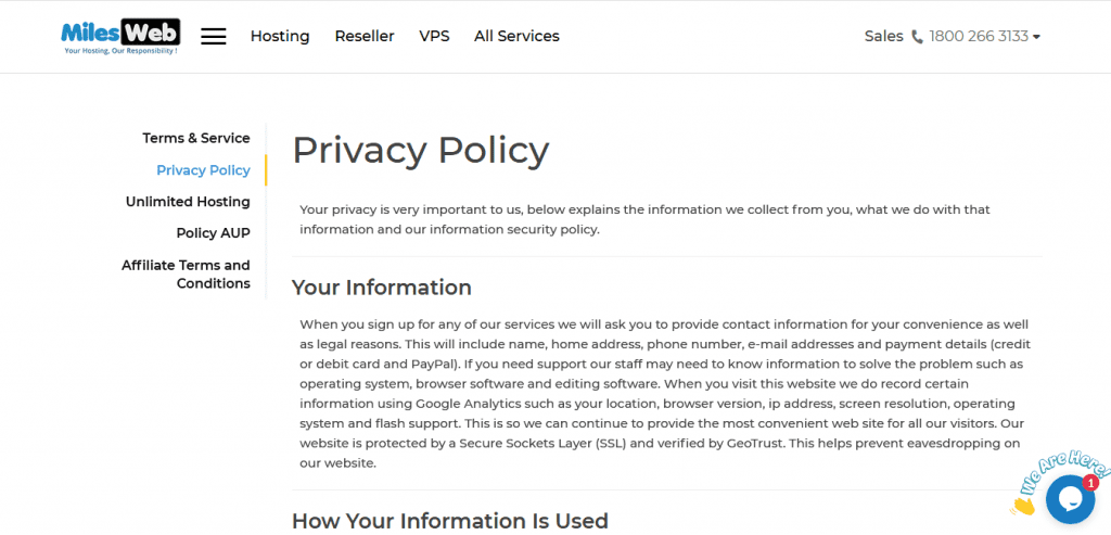
Every website should have a privacy policy as it lets your website visitor know why you take their personal information. On this page, display how any personal information and data (e.g. cookies, advertising, emails, etc.) collected will be used, and if it will be shared or not with third parties. You must strictly follow your privacy policy. For example, check the MilesWeb’s Privacy Policy page.
What to include:
Include the type of data you collect, how it is collected, the way visitors can obtain a copy of the information you ask for, if such content will be shared, and if so, with whom.
Terms and Conditions Page
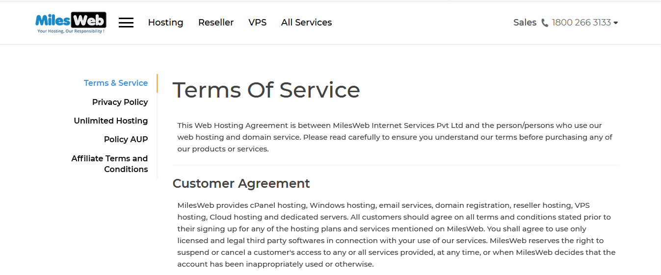
This page is similar to the privacy policy page and is a must for most websites. This is a page containing the “rules” a visitor to your site must agree to follow in order to use your website. Check MilesWeb’s Terms Of Service page.
What to include:
Mention the rules and guidelines and your website’s functionalities. For example, the country’s laws that govern the agreement, an intellectual property disclosure that specifies that your website is your property and that it’s protected by copyright laws, and links to other sites clause that you are not responsible for or can control the third party links on your website.
Sitemap Page
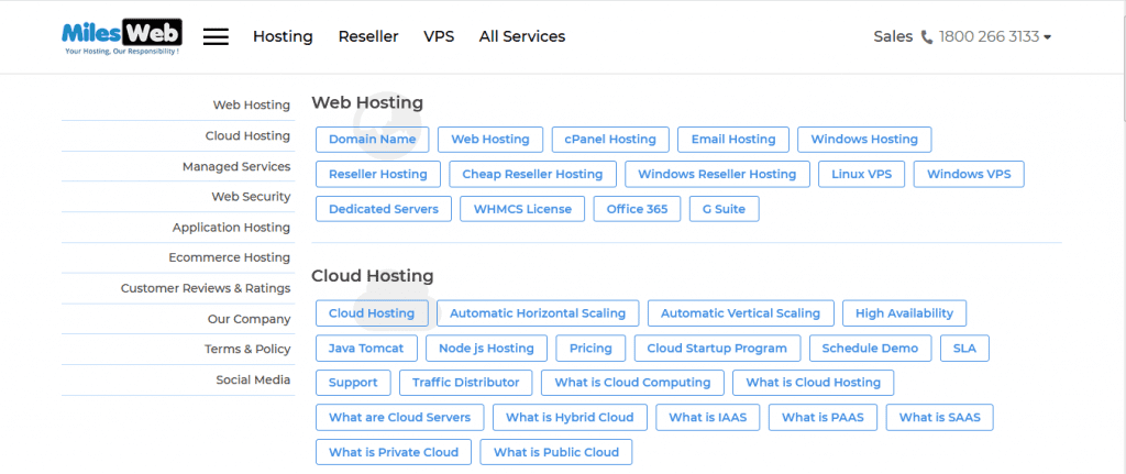
Sitemaps come in two formats – XML and HTML. XML sitemaps are made for search engine bots and help search engines discover if your content and is good to have from an SEO standpoint. HTML sitemaps are made for your “human” visitors. Basically, a sitemap page is a non-fancy index page that lists all the web pages you have on your website. For example check out MilesWeb’s sitemap page.
What to include:
Specify the links to all your web pages blog posts. Place the sitemap in the footer of all your website pages, where possible. In case of WordPress, you will get several plugins that will help you in building an HTML sitemap.
Page Not Found Page
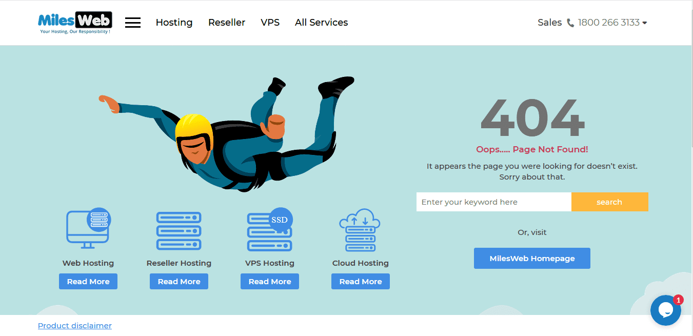
With a page not found page (also called a “404 error” page technically) is a page your visitors get directed to when a webpage doesn’t exists, has moved or expired. For example, check out MilesWeb’s custom created “page not found”. Since a 404 error page can be a standard HTML page, you can (and should) customize it in the way you want.
What to include:
Let visitors clearly know that the page they are finding isn’t available. The ‘page not found’ page should include a link back to your homepage and along with a content search form.
Related: Why A 404 Page Is Important? How To Design It Creatively?
How Much Content Should My Website Contain?
Website Navigation
It can be quite overwhelming to plan and organize website content, especially if you have too much of it. I am going to show you how to tackle this in sensible way.
Website Navigation is the Replica of a Restaurant Menu
Ensure that you create categories for organizing your website content similar to a restaurant menu card. In a restaurant menu card, several menus are usually divided into categories and subcategories. For example, pastas will come under Italian category and brownies will be listed under Desserts, etc.
Suppose you are a digital marketing company offering different interior designing services such as “SEO,” “link building,” etc., you’d want all those services listed under one category, on one tab of your main menu. Check the below image. This means each service should have its own page.

Your main menu should be so clear that your visitors should understand what they are going to get at a glance. Using creativity to convey this message in your menu bar would be the best. This will also make it easy for the visitors to get the links to the individual pages of the services.
Website Content
There is a very simple answer to this question – the more content you have on your site, the better. But I would warn you: quality is above quantity. Definitely more content is better, but only if you are producing something that is classy and intuitive for your audience. Google considers quality as well as quantity, so ensure that everything you post is top-notch.
Long Form Content vs Short Form Content
Long form versus short form content is one hot debate topic among SEO consultants and content marketing experts. So, what is the perfect length for a piece of content on your website? Since several years we have been hearing that the magic number for the blog posts and articles is around 500 words. This word count is considered long enough for expressing useful information but it is not too long that people will stop reading. As per the recent statistics, the longer content is trending among the sites that actually rank high on Google. This data results indicate that the websites with a content of 2,000 words or more rank high on Google instead of those 500-word limit articles.
While debating on the length of your content, you shouldn’t miss your audience and the value they will take from your post. There are some subjects that need more words in order to deliver information of value while some require just few words to get across everything required. If you use few words, your readers might feel as if they are cheated but using too many can also overload them with information and divert them from the important aspects of whatever you are trying to convey. Therefore, there is just one rule: use the number of words needed to convey the essential information/message.
With this you will get the posts of varying lengths and your reader won’t be disappointed with too little information, or get bombarded or bored with superfluous words.
Landing Pages
After organizing your website content based on menus such as Home, About, Contact, and Blog, let’s learn about landing pages. Landing pages help in setting up the organizational structure for your remaining content.
Website landing pages are a sales opportunity and so they are important. These can be windows for conversion which means you can influence a website visitor to become a customer. Therefore, don’t take landing pages lightly or treat them as an afterthought.
All things such as each service you offer, each product you sell, each subject matter you report on (for a media site), should have their own landing pages. Your website content can be considered similar to products available in a large retail store. Oils, soaps, eateries, utensils, etc. each have their own compartments and within each aisle, each type of product has its own spot.
So, while finding essential oils, hair oils, and vegetable oils on the aisle for oils, you will find hair oils grouped separately from essential oils and vegetable oils. When your content is grouped and organized in the same fashion, it makes the UX of your website friendlier and more pleasant. If you walked into a large retail store and found hair oils in the aisle for eateries, you would surely get frustrated and leave the store. If your customers encounter a bad experience, they feel betrayed and their time has been wasted. Ensure that you don’t do this with your website visitors. You can make them feel welcomed (and encourage them to return) by posting the content in a simple and easy-to-navigate manner.
Related: How to Improve Landing Page Performance of Your WordPress Website?
Headers
In the retail store example, “oils” would be the header. It’s the main category for a countless of subcategories that fall under it. Headers are similar to headlines and allow your website visitors to instantly find the information they are looking for in the most noticeable manner. Making things noticeable is a good thing when it comes to website UX.
Avoid These Things
Cluttered Navigation Bar
Based at the top of your website, the navigation bar is the main navigational menu that helps visitors move from one page to another. Now that you have learned to organize your content neatly, don’t get so excited that you dump the entire content at one place. Using the navigation bar, you can display your main product, service, or topic categories (i.e., oils), then display the subcategories (i.e.,hair oils) in a dropdown menu for each one.
Long Drop Down Menus
Make sure that you keep the dropdown menus short so that they match the length of your web page. Create a pleasant UX for your visitor. You can consolidate subcategories and rely on “more” in order to keep the length of your dropdown short
Organized website content shows that you care about the visitor experience on your site and value their time, which will encourage them to return. This may show your loyalty to your customers. So, check your site from customers’ point of view. See if there is anything that can be improved or any content that needs clearer pathways.
How to Prevent Your Website Content?
It hurts badly when people constantly rip off your content then may you be graphic designer, photographer or a blogger. Images can be modified and displayed on other websites, without giving you any attribution. One of the most common methods of content and image theft is stealing visual or textual content directly off your website.
Below are a few methods that can help you protect your website content:
Preventing Image Theft
Image Copyright laws are globally accepted and apply to everyone who uses the internet. If you create a design or photo, you are the by default creator of your work, even if you haven’t mentioned it on their website.
If someone tries to steal the creator’s work, it’s unethical as well as illegal.
Images such as photographs, graphics, cartoons, drawings, are considered artwork. As per international laws, only the creator can allow to reprint their work and its usage. Many people think that if it is available online, it can be used anywhere they like, but that’s not the case.
You will find free or publicly available images on many websites. You might feel proud when other people use your work, but you might get annoyed to see that your work hasn’t received any credit. Many of you don’t know the way to stop this stealing progress completely. Below are a few ways to prevent images and discourage your image-thieves:
1. Disable the Right Click Option
All know how to copy something. You just need to right click the mouse and select ‘save image as.’ You will see that image is copied in your download folder. So, disable the right click option on your image, which makes it difficult for an average user to copy your artwork.
This can be done using plugins on your website.

The best and one of the most used WordPress plugins, Envira Gallery Lite keeps your images safe. It helps you to create beautiful image galleries as well as supports image protection. For activating the plugin, go to Envira gallery Lite “settings” and click on the Add-ons tab. After that, go down to find “Protection Act”, click and save it. Then create image gallery with the plugin and select the available option of “Enable image protection.” This will disable the right click option on your images.
WP Content Copy Protection & No Right Click Images Plugin

By using the WP Content Copy Protection & No Right Click Images Plugin, people are restricted to use your words without your permission. It does that by using JavaScript and CSS techniques and secures your home page and posts. Some of its built-in features are as below:
- Restricts right-click or context menu
- Displays alert message, HTML Ad or Image Ad on save images or right click
- Disables the keys such as CTRL+S, CTRL+A, CTRL+C, CTRL+X and CTRL+V
- Offers advanced and easy to use control panel
Important: It isn’t recommended to disable right click for securing your website content. If you disable right-click, you disable a lot more than just ability to copy images. It includes disabling users’ usual way to navigate back and forward, print or copy text for reference and so on. This might make your visitors annoyed at you or think that your site is broken.
2. Create Galleries
It is quite a tedious task to upload images one by one on your website. Instead, you can easily create. After creating the gallery, remember/jot down the HTML code that allows you to include the gallery in any creator’s work. Due to this, you can continue adding photos to the gallery even after it is uploaded on your website. This can be done using the below plugin:

The NextGen Gallery plugin streamlines the process of creating a gallery. It caters you with extra options like the lightbox, slideshow, adding images, uploading entire zip files, etc. You can use it with any theme which makes it the most used plugin for creating galleries.
3. Use Watermarks on Images
Using a watermark means to keep your digital information out of sight in a carrier signal. You can use it on your stock photography WordPress websites. With this, you can find the source of illegally copied images.

Envira Gallery plugin offers you numerous features for your website. It allows you to Watermark as an add-on, but for that you need a silver license. After getting the silver license, go to settings of your Envira Gallery and click on the ‘add-ons’ tab. Then search for Watermarking among the tabs, click on it and install on your website.
4. Include Copyright Notices
You can add a copyright notice but it just helps to scare people to use your artwork. You will get notified with a message that stealing pictures could lead to a serious offense. This will refrain people from stealing and using your art.
A copyright notice can be added in a footer file by adding an HTML as below and need to update it every New Year:
© 2009-2019 yourwebsitename.com
5. Add a DMCA Badge to Your Site
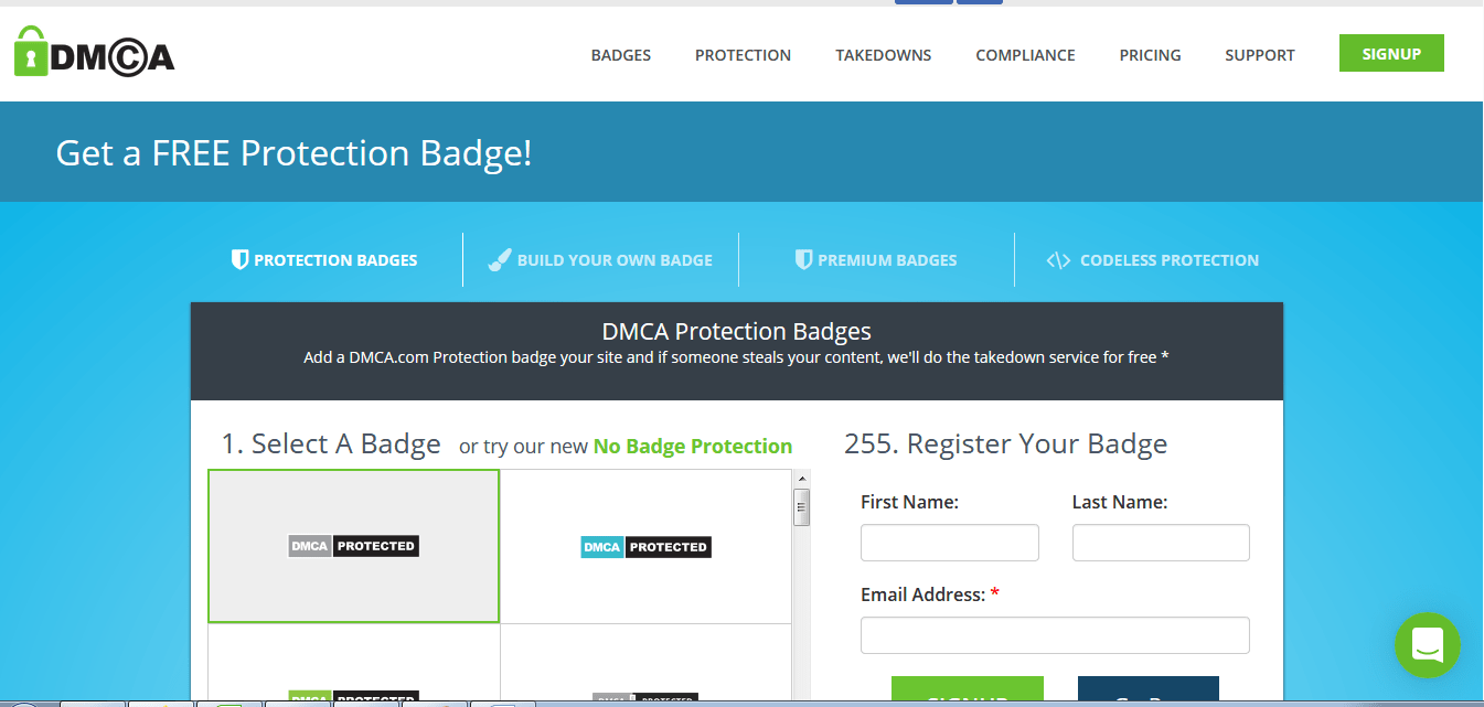
The DMCA offers free as well as paid protection for your site. In case someone is using your images without your consent, a threatening legal action will be taken on your behalf. Being an automatic process, it usually includes scares infringes into taking your pictures right away. So, a DMCA badge added on your website acts as an obstruction for content or image thieves.
A DMCA plugin can be found in your WordPress account. Simply install it, and it will automatically insert badges on your web page.
Preventing Content Theft
Today people want to do an easy work and therefore, copy content from a website and add it to theirs without giving any credit to the original post.
One can only use the headlines or excerpts from your text but not the complete content. In case someone steals the complete article without your permission, you should raise a concern for content theft arises. Check the below plugins that you can use to prevent that from happening:
1. Feed Delay

After publishing a post, a robot scrapes it without any attribution link and indexes it before you do. Due to this, your post appears to be as duplicate to the search engines. Therefore, they rank your page below the ranking of your content thief’s blog, leaving you embarrassed and disheartened.
Feed delay is plugin that saves you from this by delaying the posts from getting added to RSS for preferred amount of time. The timing is adjustable and this will help your content to get indexed.
2. Tynt Insight

Tynt Insight plugin sends a notification when your content or images are getting copied. This plugin can be set up by adding a snippet code on your website.

You get an RSS menu with Yoast SEO plugin that allows you to add content directly below and above every post. Any content can be added to it. For adding an attribution link to the RSS feed, you’re given a special link. The moment your stolen content gets republished, it’ll provide a link to your post and readers will easily know who the original author is.

As mentioned above, disabling the right click on a page can stop the content from getting copied. You can do the same to prevent content theft from your website by using WP Content Copy Protection plugin. It disables image drag and drop, right click and various keyboard commands.
5. Plagiarism Checkers
There are various plagiarism checkers available online such as Grammarly and others. You can use them to check your text for plagiarism.
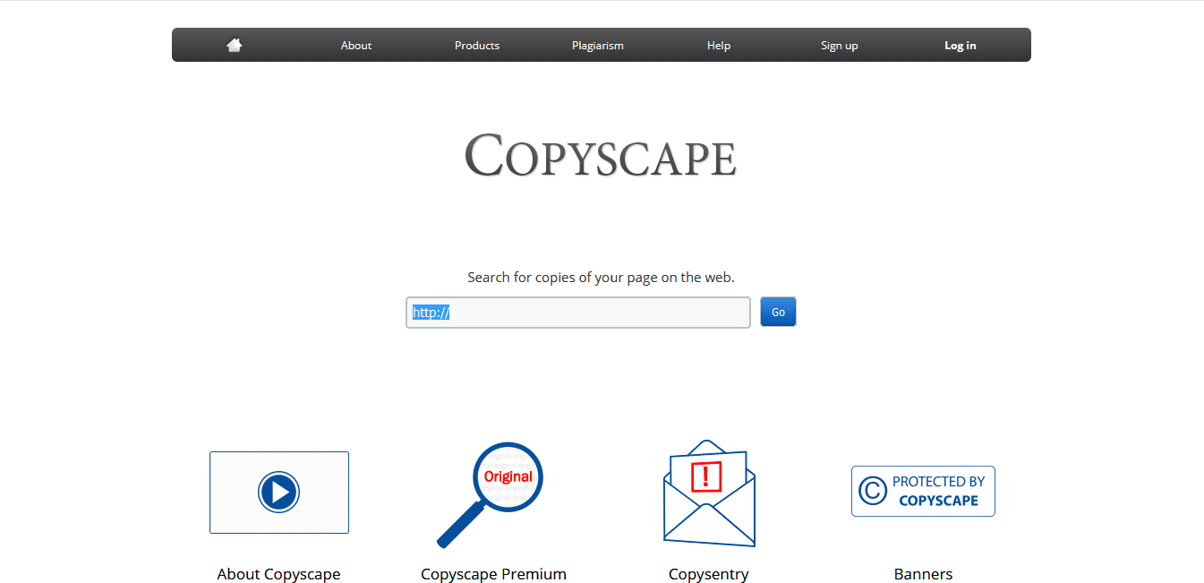
Another tool, Copyscape is more popular as it can check an entire URL for plagiarism. Additionally, it allows you to add a “Protected By Copyscape” notice on your website.
So, be careful as there are content and image thieves that are lazy enough to steal your content. Using the above plugins, you can avoid content theft and publish your artwork with a peace of mind.
The 5 Big Content Trends for 2020
Content marketing and SEO will be getting high value in 2020.
Today, we are heading towards the bright future of more helpful, useful, technically amazing content that adjust with user habits, preferences, and search needs.
Content is getting better because writers are getting smarter in terms of strategizing, researching, creating, and publishing it.
It is no more a marketing experiment today, but a proven strategy that can do wonders for any brand.
Let’s now check in what are the big content trends for 2020.
1. Next-Level Visuals will be Introduced in Content
In 2020, we will see visual-forward platforms in trend again.
From entertainment to communication, people are focusing on using dynamic or interactive imagery.
For the adults-to-be in 2020, visual social media will rule the highest.
As per the Pew Research, Instagram, YouTube, and Snapchat are the most popular platforms where teens hang out.
YouTube is the most-used platform as compared to Facebook.
So, basically visuals in content will be more appealing in the coming year.
For instance, you can create your own augmented reality (AR) filters and lenses for Snapchat. Also you can create your own GIFs from video clips via Giphy. This means you can GIF yourself instead of using it from a TV show, movie or character.
You will find endless possibilities and marketers will surely take the advantage of custom, dynamic and branded imagery for their content.
2. Video Content & Visual Storytelling
Video was trending in 2019.
YouTube, dynamic imagery, and AR have become popular and so the video content and visual storytelling will continue to increase in 2020.
As per Statista, in 2018, 85% of internet users in the U.S. didn’t miss to watch video content monthly on any of their devices.
Also, as per the HubSpot survey of over 3,000 consumers, 56% from 25-34-year-old group and 54% from 35-44-year-old group want to watch more video content from the brands they love.
Additionally, 62% of consumers say that video is the type of content they absorb completely. This indicates that they pay more attention to videos.
For marketers this means, as consumer habits and preferences continually demand video content, they have to create more video or accept the failure.
A successful video content gets more views as compared to normal video that gets just five total views for example and this is the quality of the storytelling. It is important that your content should have the ability to engage readers through any medium, including video.
If you are a great story teller, you have already reached halfway of success.
3. Upping Your E-A-T
Do you remember in August 2019, Google published a blog on Webmaster Central related to reminders about its core updates and what to do about them.
In that blog, a specific action was recommended that a lot of us have already been doing:
Reading/understanding the Search Quality Rater Guidelines and E-A-T (Expertise, Authoritativeness, Trustworthiness).
The reason for Google’s pointing to this resource and mentioning E-A-T separately was a huge hint. So, your focus must be on proving expertise, authority, and trust in your content.
This is applicable to websites as entities that represent a specific brand or organization, and individual authors that write content on those websites.
Ways to prove your E-A-T
- Get links or mentions from other authority websites.
- Provide E-A-T information on your site, including a bio and credentials on your about page and author pages.
- Link out to authoritative sources for supporting data, stats, and facts in content.
- Keep your site and content updated regularly with relevant, accurate, current information.
Apart from that, your content must be outstanding. Remember if your content is well-crafted, user-beneficial, purposeful backed by E-A-T, it can’t lose.
4. Better, More Purposeful Content Than Ever Before
In 2020, the need for quality and focused content continues as in 2019.
There are many creators and marketers that understand the need for highest quality content:
- As per the Content Marketing Institute’s B2B report, 90% of the most successful content marketers put their audience’s information needs first over their promotional message.
- Content creation was the content marketing area where spending increased the most from 2018-2019.
Marketers are now realizing that better content is a must to win in the SERPs and with readers.
Ranking for competitive key terms will get harder when everyone is doing their best.
That means the following trends will be followed in 2020 by all types of brands:
- Brands will understand the needs of target audience from search results for a particular keyword.
- They will focus on writing that suites the audiences by maintaining consistency for the brand’s tone and style.
- A better research will be done, including more current stats and data from reputable sources.
- Brands will go in-depth to explore the topics.
- They will use better visuals, such as branded imagery, infographics, and custom blog images.
It is going to be harder to rank and more people will be creating better content.
5. Ultra-Targeted, Customer-First Content
The customer’s informational needs were prioritized above sales messages was one of the factors for identifying the success of marketers in 2018-2019 as per the CMI’s 2019 B2B report.
90% of the most successful marketers agreed to this.
These marketers know that trust-building with audience starts with offering guidance, help, information, or entertainment without a catch.
Moreover, the best content that hits the user’s needs perfectly is the one that will rank number 1 in Google in 2020.
Research, asking questions, engaging with the community and discovering your audience is the best way to find the needs of your unique audience from your content.
After knowing them, you can create content that coveys your message to them on a deeper level.
The ultra-targeted content considers the audience first. It hits their user search intent, serves a purpose and fulfills the information requirement.
Google is prioritizing such content now, and so content writers need to focus on it for the future.
What is the Future of Content?
The future of content is near and hasn’t appeared to be so pretty.
There are several marketers that prioritize the quality and customer’s information needs over sales messages. So, focus on building trust and authority with authenticity and avoid using sales tricks.
Furthermore, visual media taking an incredibly new and exciting turn. There are quite good possibilities for integrating it with the content.
Innovative marketers will cross the boundaries of content creation in 2020.
In 2020, the content you will see the content committed to customer-first approach, ultra-targeted content, and generally, better content overflowing the scene.
Tips to Update Your Website Content
Your Content and Business Growth Should Go Hand-in-Hand
May it be any business, you will be making constant changes to your products, services or whatever else that you offer.
For example, if you offer services then you are likely to change what’s included in your services often as you develop your business. In case of a product website, you may release new versions or varieties of your products. Also, your team members might move on and you might recruit new members.
In case of a personal blog too, things will change and you’ll need to update. For example, for a parenting blog, you might have mentioned the age of your children, which is surely going to change every year.
This indicates that even if you feel your website is complete, your content is going to get outdated quickly.
Updated Websites are Rewarded by Search Engines
There are very few people that realize this, but if you never update your website then your search engine ranking will keep on dropping. The reason is search engines keep a track on how often you update your website which lets them know that it’s active and fresh.
If you don’t update your website for 3 years then search engines will see it as being neglected by visitors and not worthy to be ranked high.
Therefore, it is important to regularly update your site for quickly and easily boosting your search engine position.
No don’t completely rewrite your website content regularly. I just mean that make minor tweaks fairly regularly, and maybe bigger changes occasionally. This helps the search engines know that your site is fresh and up to date.
Make Your Website More Effective
Today, website owners can access valuable tools to know the number of people using their website. This data helps to make your website more effective and increase your success.
Leaving your website as it is and not updating it regularly, might lead to missing a valuable opportunity. So utilize this important data by analyzing it and learn from it. Use the research to revise your website content and enhance the visitors’ experience.
Grow Conversions by Regularly Changing Your CTA
Almost all websites want to ‘convert’ their visitors into leads. This is possible by selling products, obtaining newsletter signups, contact form submissions, or something else.
Calls to action significantly influence your conversion rate. A ‘call to action’ is basically any part of your website designed to inspire visitors to take a particular action (which, in turn, leads to a conversion). This can include ‘Contact us’ buttons linking to your contact form, e-commerce product ‘Buy’ buttons, or maybe newsletter ‘Subscribe’ buttons.
There’s a lot of research been done on conversion rate optimization. By following the best practices in terms of calls to action as well as design and layout, you can significantly improve conversion rates by making ongoing chances over time.
The analytics software can be used to monitor and review your conversion rate on a regular basis. In Google Analytics, this can be mentioned as conversion or goal tracking, or the reporting on a specific part of your site such as an e-commerce package or newsletter signup form.
Don’t forget to make regular changes to your calls to action. Enhancing your website content in this way can help you convert more visitors and make a big difference to your conversions.
New Research & Best Practice can be Implemented
Being a web geek, I’m sure you might have gone through several articles about creating better websites. That might include UX design, effective typography, etc.
The basic aim of this research is to enhance your work and implement the best practices for improving your clients’ websites. Also make the same changes to your own website too.
Adopt Current Web Design Trends
When web design comes into the picture, most people think of design. But, website content also comes into changing trends.
For example, there were some websites earlier with cluttered pages having one or two sidebars as well as the main content area. But the trend has changed recently. Web design now includes uncluttered, simple content without distractions.
You can keep your website as it is without initiating a major redesign by refreshing your content to keep up with the latest trends. For example, you can eliminate the sidebar and instead embed calls to action directly in the main body of the page.
Enhance Your Website Navigation Over Time
When you design a website for the first time, you obviously plan the navigation structure to be as easy as possible. But it gets outdated after some time.
When new pages are added and other changes are made, the structure often becomes illogical and confusing for the visitors. You website can be made more intuitive by regularly refreshing your navigation structure.
A website’s navigation should also evolve when you keep on adding content. For example, a new blog works best when posts are presented in a standard format with large images. After having dozens or hundreds of posts, your old posts start losing traffic and becoming hard to find. Traffic to your blog can be increased by improving the navigation, for example, adding an index page will help visitors find posts more easily.
Optimize Your Website
When you design your website at first, you do some keyword research for identifying the best phrase to optimize for.
You then write (or ask your client to write) the website content around these keywords.
But keywords should change over time as the search intent of visitors’ changes. In Google Trends, if you type any key phrase, you’ll see that specific key phrases become more and less popular at different intervals. Therefore, you can improve a site’s SEO by doing a regular research for the best keywords and re-optimizing the website content accordingly.
Add SEO-Friendly Content
This applies to blog posts as well as latest news sections, portfolios, case studies, upcoming events, etc. By adding SEO friendly content, you can keep your website’s look new and fresh.
You can grow your website’s content, using a blog. Each new article should be framed around a different keyword.
Your articles help you rank for different key phrases. With the articles, you will have wider variety of website content as compared to writing everything for once and then leaving it.
So, write a list of possible topics as soon as you think about them and try to link them in your new posts.
Keep Your Website Legally Compliant
As per the new GDPR regulations website owners worldwide (not just in the EU) have been forced to update their content to obey the new legislation and ensure compliance. As a web professional, you should do this on your own website as well as your clients’.
You are responsible knowing the legislation that can affect your business and your website, and for updating your content accordingly.
Coming to the End
At last, you have learned everything about website content. I would say that website content plays a key role in visitor engagement, SEO and website appearance. So, when you are designing the content of your website, don’t miss to go through all these points.
Let me know if I have left any point uncovered or if you have something to share about website content, comment in the box below.


