Fonts are crucial element on the website that engages visitors. There are over 10,000 website fonts on the internet. These fonts are used in headers, paragraphs, and the body content. Are you not finding the right font for your Elementor website? Well, you must consider these fonts for your next project. Selecting the perfect Elementor fonts enhances readability, strengthens your message with clarity, and leaves a lasting impression that sets your brand apart.
According to research, there are over 1,000 Google font libraries, almost 2,000 Adobe fonts, 15,000 fonts at Fonts.com, and nearly 35,000 fonts at MyFonts.com while writing this article. So, choosing the right font will be an overwhelming task for you! Thus, we have compiled the best list of Elementor fonts.
Table Of Content
Why Website Fonts Matter?
Almost 90% of web design matters because of fonts. Therefore, choosing the right fonts is crucial to make the website visually compelling. Here’s why?
1. Font Choice Reflects Your Brand Character
Most marketers know their brand’s message, but choosing the relevant font reflects the brand’s character. Calligraphy is a font used for poetic expression or a quirky meme. This font is not suitable for web hosting or IT-related websites. Banking websites sometimes prefer Arial or Calibri so their consumers will take the brand seriously.
2. Readability and User Experience
If the font is too tiny or unprofessional, readers often have to press their faces against the screen to read the text. This leads to a negative user experience, which visitors count as a loss on the website. Also, don’t make a website too clumsy by adding more than three fonts. Ensure uniformity and clarity throughout the website.
3. Business Growth
UX factor is directly proportional to the business opportunities. If your visitors are comfortable reading the website’s content, the engagement rate will be higher. Websites successfully retain visitors’ attention with engaging content written in premium and reliable font catch. It helps in building customer trust, increases competitive advantage, and enhances business opportunities and profits. Fonts are essential for your brand or company because you want them to evoke positive emotions, provide easy readability, and improve your bottom line.
What are Different Elementor Fonts Categories?
There are multiple Elementor font categories, and each variation has a place depending on the brand. Some fonts are elaborative and noticeable, while others are simplistic and versatile. The various font categories are as follows:
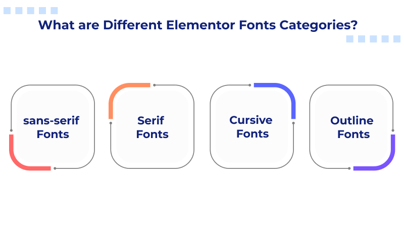
1. sans-serif Fonts
sans-serif fonts are those without markings at the end of the letters (serifs). sans-serif fonts are usually simple in design, making them versatile in terms of placement and use. They go well in the body of a page or header text. This font category encourages visitors to read the page all the way through, so sans-serif is the font for you.
2. Serif Fonts
Serif fonts are similar to sans-serif fonts in terms of stability and predictable structure. Serif has a long typography history, and the style of each font often feels more traditional and sophisticated than others. You can use such font categories either in the body or headers of the website. Accessibility is another reason to opt for the Serif fonts.
3. Cursive Fonts
Cursive fonts are popular for academic and digital writing. They are a century-old handwriting style designed to make handwriting quicker. In modern times, cursive script has become a unique Elementor font for websites. Kellogg, Ray-Ban, and Vimeo websites are popular examples of their use cases. However, remember that they are not an ideal option for longer texts.
4. Outline Fonts
You can call block letter font styles like Mangbow, Zing Rust, and others outline fonts. If more conventional serif styles and sans-serifs don’t align with the brand’s value, then this is the right category to prefer. Because outlined fonts decrease the text’s readability, you won’t find this font category more usable.
How We Chose the Best Font for Websites?
When choosing the best web fonts for this list, we wanted to ensure that each of them meets specific requirements.
- Legibility: Always choose a font that is highly accessible and improves the reading experience. Also, it should be unique.
- Readability: Don’t use fonts that are too tiny. Instead, we prefer styled fonts in the body that are designed for specific parts of the website.
- Comfort/Familiarity: Websites must have comfortable fonts that create a pleasant experience for visitors. Arial and Calibrity are the best examples of this, as they are sleek and elegant on websites.
- Lightweight fonts: These fonts are the tip of the iceberg, which determines the website speed. These fonts won’t be available with pre-installed WordPress in WordPress hosting or the page builder plugins. Hence, install them from third-party websites.
Best Elementor Fonts For Websites
Are you confused about which one is better for your website? Here is the right guide for you.
1. Arial

According to FontReach, Arial is the most popular website font, and it is used on over 6 lakh websites worldwide. Google, Amazon, and Facebook are popular websites built with the Arial font. It was first used in IBM laser printers. It is a web-safe font with a highly readable UI (User Interface) score. Although it won’t look visually compelling, it is a standard font regularly used on websites.
2. Neue Helvetica
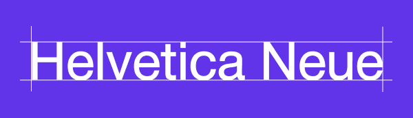
Neue Helvetica is the second most popular web font, with over 2.1 lakh websites [Source] using it. Yahoo and eBay are its popular use cases. Its history is glorious in typesetting, and the icing on the cake is the digitized “Neue” version of it. Neue is more straightforward, easier to read, and works equally well with header and body text. The font family comprises of 128 different typefaces, covering light, heavy, Roman, outline, condensed, and other stylings.
3. Lato

Lato is a Google font designed for a corporate client in the early 2000s. Later, this font was repurposed and given life as one of the most popular web typefaces. Lato is used on websites like Goodreads, WebMD, and Merriam-Webster. This font strikes a balance between gentle curves and sturdy design, giving off a powerful but welcoming atmosphere.
4. Montserrat
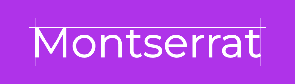
Montserrat is a geometric sans-serif typeface designed by Argentine graphic designer Julieta Ulanovsky and released in 2011. It has a rich architectural history and was created to preserve the typographic culture of the Montserrat neighborhood. Its popularity is primarily due to its accessibility, versatility, and functionality.
5. Roboto

Roboto is a recently launched Elementor font that is used in technology websites. The typeface has a techy, machine-like feel to it, and the wide-open characters also give it a friendly touch. Google originally designed it as an Android system font, but it is now used on websites such as YouTube, Flipkart, and Vice.
6. Lora

Lora is a contemporary serif font. The unique brush strokes on the character end give this font a more artistic feel than other series, even though it does its job in terms of helping website visitors read the content. This font works well with the paragraph text of news and entertainment websites like FOX News, Urban Dictionary, and The Kitchen.
7. Merriweather

Merriweather is a Google Font explicitly designed to enhance readability on screens. Goodreads, Coursera, and Harvard.edu websites use Merriweather to style their paragraphs. It also has a sans-serif counterpart for creating a blog or other text-dense websites. By pairing these two fonts, you will keep the focus on the text rather than any surrounding distractions.
8. Times New Roman

In the 20th century, the Times of London was looking for a new typeface that could work as a Monotype designer. This is when Times New Roman text was invented. To date, the digitized TNR is a recognizable, popular, and legible web font. Websites like the Daily Mail, Huffington Post, and Wayfair all use it. As a bonus, it’s web-safe, too.
9. League Gothic
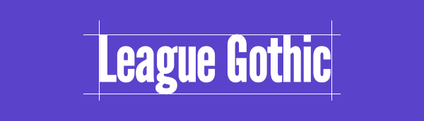
The League of Moveable Type revived a classic font lost to the public domain after the original foundry went bankrupt. League Gothic works well on the web, mainly when used for titling more serious endeavors. Websites like Chron.com, FOX Sports, and The Blaze use it.
10. Raleway

Raleway was originally intended to be a single font weight, but over the decades, it has expanded to include nine weights, ranging from thin to black. Similarly to Calendas Plus, it offers old-style features. This neo-grotesque font also comes in a geometric sans-serif style. A variety of styles and characters are available and the web designers can decide how to use them to their advantage.
11. Milkshake

Do you want to fill the space with thick cursive fonts? Milkshake is an Elementor font to consider. Unlike cursive fonts that closely mimic actual handwriting, this one is best suited for titles and logos. Its bold and playful style makes it ideal for brands with a fun personality, though it may not be the right fit for more formal or traditional brands.
12. BoldPrice

BoldPrice is a number and currency font designed with a vintage edge. It comes in 2 different styles, whereas in the first one, you can see the solid typeface. The other style available is a bold one without the woodcut engraving look. The fonts would look lovely in logos or on websites for diners or restaurants, consignment shops, and other businesses with an old-school vibe.
13. Didone Room Numbers

Didone Room Numbers is a numeric font styled similarly to Clement Numbers. If you love the style of Clement but find it too bold for your logo or display text, this could be a great alternative. However, it is important to note that it only includes numbers and currency symbols, so you’ll need a separate font for other punctuation marks.
14. FreeLine

FreeLine Elementor font is mainly suggested for fashion websites and branding. However, its outlined lettering and open-air text style give it a futuristic feel, making it multipurpose. The geometric lines give this font a sense of speed as if it could zip across the screen in an instant. This makes FreeLine a sleek and stylish choice for website titles and branding in the technology, aviation, and automotive industries.
15. Burford Rustic
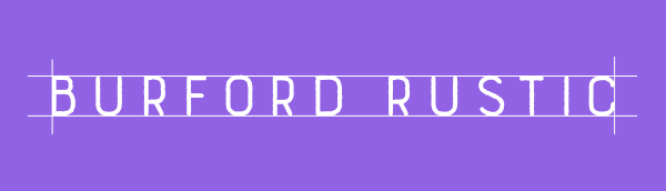
The Burford Rustic font family includes 20 styles, with 18 featuring a rustic and grunge-inspired look. If you’re looking for vintage-style icons to complement your text, this font family has you covered. It’s a perfect choice for small or family-owned businesses in rural or rustic settings, such as campgrounds, lakeside retreats, and bed & breakfasts.
16. Lazer 84

Lazer 84 instantly evokes the 1980s—think Roadhouse, Child’s Play, and Baywatch. Brushed fonts like this were a staple in movie and TV show openings from that era. If you’re designing a website for a company founded in the 80s that wants to embrace the style of the time, this font is perfect for titles and headers. It’s also an excellent choice for tech-focused websites with a retro video game aesthetic.
Online, there are tens of thousands of fonts to choose from. Selecting the right fonts for your website can be challenging, but this guide will help simplify the process.
When you choose fonts, it is recommended to use two or maximum three fonts for a website. This ensures a consistent look throughout your interface, strengthening brand recognition while keeping the focus on your content rather than an overwhelming mix of typefaces.
For more tips on choosing the perfect font, check out this comprehensive article. And once you’ve found the right one, you’ll see that adding custom fonts to WordPress is easy—especially with Elementor.
FAQs
Can I use Google Fonts with Elementor?
Yes, you can use Google Fonts with Elementor. Elementor has a built-in integration with Google Fonts, giving you access to a vast library of free fonts. You can easily browse and select your desired fonts directly within the Elementor editor.
How do I add Google Fonts to my Elementor designs?
Adding Google Fonts to your Elementor designs is a breeze. Edit any text element in Elementor, go to the “Style” tab, and find the “Typography” options. Here, you’ll find a dropdown menu with a wide selection of Google Fonts. Please choose your preferred font, adjust its size, weight, and other properties, and you’re good to go!
How do I ensure font consistency across my website using Elementor?
Maintaining font consistency is crucial for a professional look. Elementor offers several ways to achieve this. You can define global font styles in Elementor’s Theme Style settings, ensuring your chosen fonts are applied consistently across your website. Additionally, you can save your preferred font combinations as custom presets for easy reuse throughout your designs.
Are there any limitations to using fonts with Elementor?
Using too many different fonts can negatively impact your website’s performance. It’s generally recommended to stick to a maximum of 2-3 fonts. Also, while Google Fonts offers a vast library, not all fonts may support every language or character set.


