Graphic design is a very challenging and interesting field that very few are able to work in. It includes various factors that are collaborated by the graphic designer with an aim to give the best, what we call as creativity. We all know that creativity is an ongoing process and all of us like to appreciate the best creativity. As I said before, graphic design is an ongoing process; therefore, it is worth to take a look at what is going on in the world of graphic design and what would be the trends for that a graphic designer should follow.
#1. Demand For Defamiliarized Layouts Will Increase
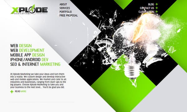
In past years, we have experienced that the layouts of websites and advertisements were quite similar. Most of the users are avoiding the use of the extreme right corners of the windows because those are filled with advertisements. But you will experience something new like asymmetrical and scattered grid styled layouts.
In this new layout, the information which you are searching for, would not be placed in traditional formats like square and rectangle. Now, it’s time to eliminate the old pattern and adopt new strategies for creative design.
#2. Three – Dimensional Will Make A Way
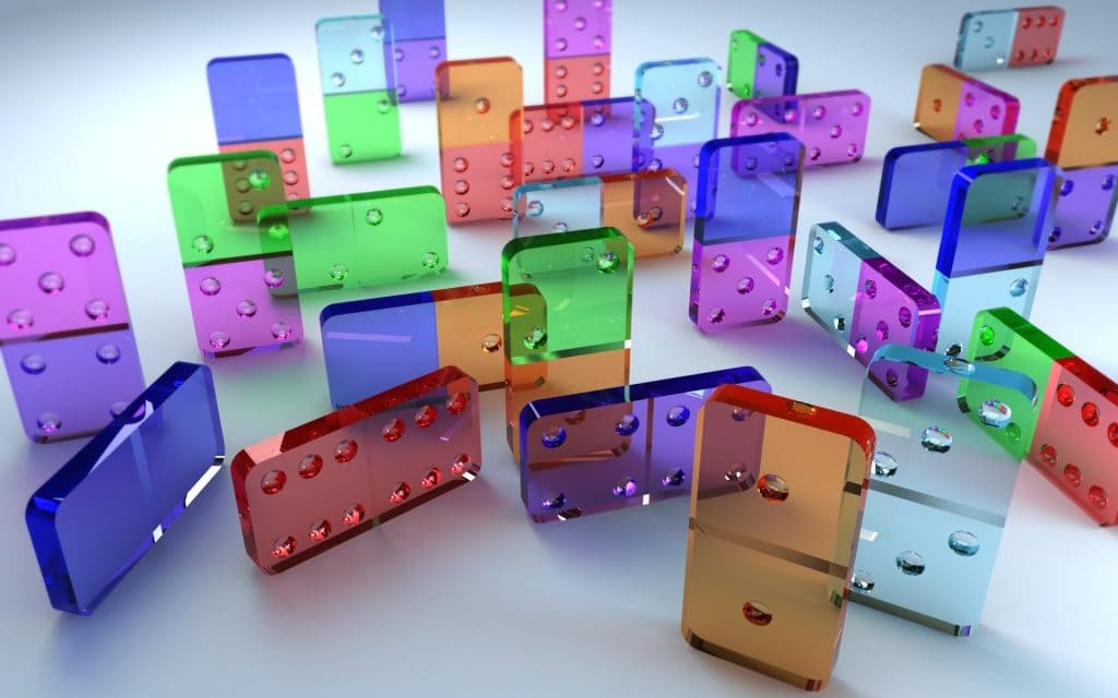
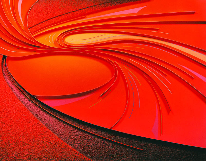
Design is one of the superior ways that makes the project worth and outstanding. Also, this motivates the designers to work on various projects to experience the new techniques in designing. In the same way, designers are taking great interests in designing three-dimensional projects. The examples of these projects are staged elements, still life representations of elements and objects in a 3D space – real or developed.
This idea generates curiosity among users because of product presentation that gives real-life experience. However, these designs are further complicated though they won’t appear like it at first sight and might represent real and created objects. In short, the trend is talking about imagination in action.
Related: 5 Reasons Why Your Website Is Underperforming And How To Fix Them
#3. Gradients
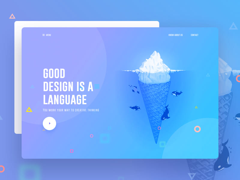
Designers have been using gradients for backgrounds, photos and videos overlays, inside images, etc. and this trend will continue trending as well. Colors have played a key role and gradients have been a major part of that role. In designing, colors are the backbone and some colors have their own speciality and those colors are the first choice for gradients. For example, bright colors can be used for a better combination. Furthermore, it is not compulsory that all gradients should be bold and bright. Some can be subtle with soft color variations. Gradients can be used with real elements, illustrations and typography.
#4. Minimal Navigation
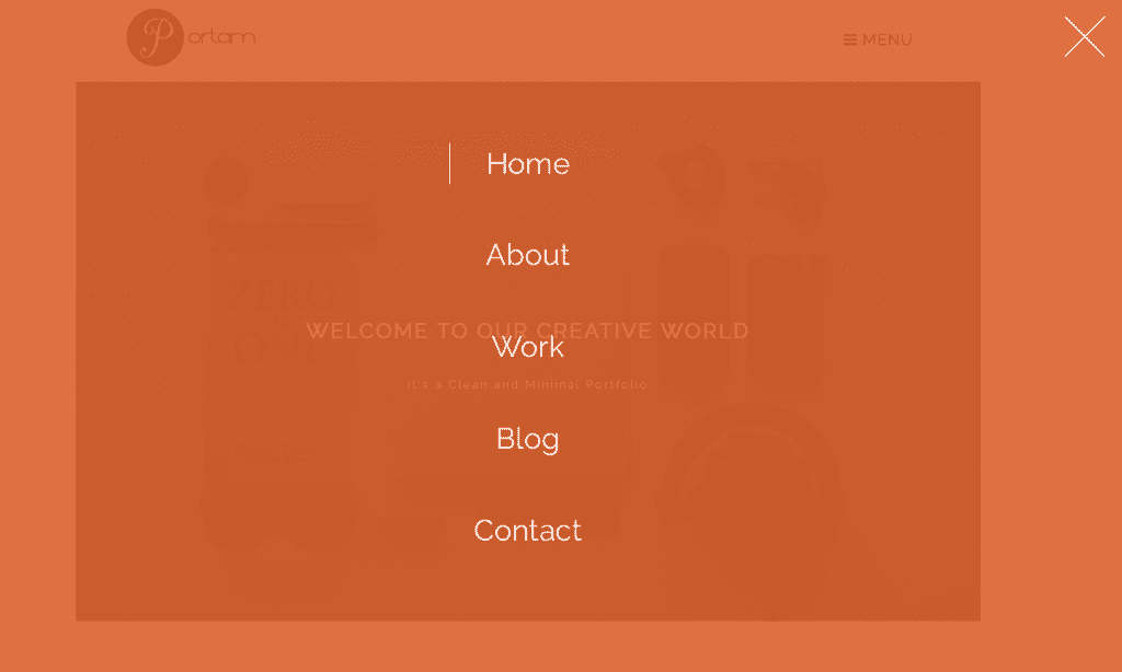
Gone are those days, when websites used to have mega menus, but now trend in graphic designing is moving towards implementing minimal as well as hidden navigation elements. You must have come across websites or blogs that display nothing on their homepage, right? Such websites or blogs ask you to scroll down for menu or display small menu boxes on right or left-hand corner on the website.
Implementing such techniques on the website will give a new way to graphic design. Such designs will encourage users to browse your website further. Most of the designers are going to focus on this trend to encounter unique navigation.
Related: Short Guide on How to Create a Website with a Theme
#5. Photo Overlays
Photo overlays are most used techniques in graphic design, this is going to make its way also. A perfect overlay can hide color imperfections and give clear text view to the users. I must say this is quite interesting. You as a business owner can focus on color overlays to turn any general image into something that will relate to your brand identity.
For simple color overlays, most of the businesses have utilized a full layer that highlights a color overlay on the image and another animated overlay that impersonates mouse actions.
#6. Fluid & Liquid Effect
The most unique and tough part in graphic design is the fluid and liquid effect. You must be wondering, why I am saying unique and tough to this technique of design. This is because the surface of water is converted into graphic design, that is actually tough to implement. I personally appreciate such techniques and will suggest all businesses to implement the same. Creating such experimental designs will increase curiosity among users and encourage them to browse your website multiple times. It won’t matter, what form of liquid you are using for giving effect, either it is water, oil or any liquid substance. This trend is going to receive a warm welcome and many designers will consider it as a challenge.
Related: 6 Tips For Creating A Spectacular Portfolio Website
#7. Outline Typography Without Colours
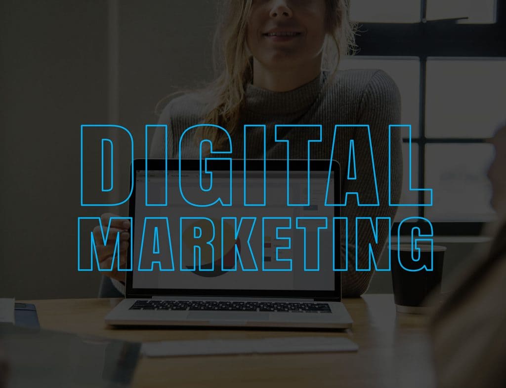
Many outline elements were introduced in designing but very few are ongoing. The outline typography is one of the techniques which is going to be trending. It is useful when you want to communicate with the users in a short period of time with lesser words. Here, you can say that creativity is the key to simplicity. This technique is suitable for website designs, interior design, logo design, etc.
#8. Custom Illustrations will Dazzle Up
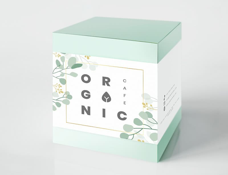
In the past, designers were following the same pattern for illustration such as bold and thick lines. But this has been transformed to delicate and elegant illustration, which is highly influenced by botanical and natural factors.
Moreover, this trend is more appealing to users. On the packaging, it looks awesome, whereas in intricate design, it gives beautiful and pleasing effect against a textured paper background. You will get surprised after knowing that, it is being utilized by designers, bloggers, social media handlers, artist, etc. However, it is expected to grow more . This trend personally fascinated me a lot with the things, which I was not aware of before. I think coming year is full of surprises for designers.
Related: 9 Keys to Make your Visitors Love your Website Homepage
#9. Large Typography
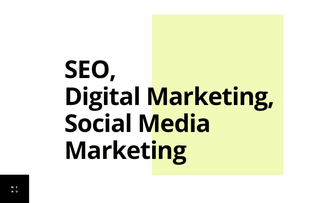
Typography makes a good amount of design, and it’s trending nowadays. Large fonts grab the attention of users quickly among the design elements. And this is why making use of these types is beneficial.
Final Words
Graphic design will introduce composition designs that will step into the imagination of the viewer. Every trend has its own challenge and standard. You only have to study which trend works better for your business and implement accordingly. Which trend you will be opting for or what is your opinion on above-mentioned trends? Share your views in the comment box below.
