Whether you have a website or planning to opt for one, have you ever thought about user experience? In my observation, I have found businesses focusing on what they want to give out rather than what their customers/audiences seek online. They overlook web design tips that may bring more conversions and go for what appeals to them the most.
Websites are one of the core factors of any business. Even if you are a blogger, you are still attracting traffic. So if the website is not user-friendly, do you think you will receive enough engagement?
You must be aware that there is heavy competition on the internet. There are thousands of websites from the same niche you have. If your website is not 1% of the audiences on the internet look, they will not invest 1% time on browsing.
It is just as essential to consider website design as you focus on sales and marketing, as it is the core factor that generates traffic, leads and conversions.
A website contributes a lot more to your growth than you expect. It offers users exactly what they are looking for and what satisfies them. Sometimes, users do not know what they need, but a good website design helps them explore their interests.
It is simple. An email requires clear and crystal content so that the receiver clearly understands the gist in one go. Similarly, a website needs to be equally clear for traffic to get it all in one place with easy navigation.
8 Responsive Web Design Tips
1. Cut Distractions
Humans are very hard to please. They will scroll through thousands of websites to find one that seeks their attention. Even if you have the best-of-best products, they will judge their browsing time from the design.
That is why I suggest you plan out your design before you put it out. And try to cut all distractions that may lose a visitor.
It is crucial to analyse the fonts, colours, graphics and animations you use. If any of these are confusing and distracting, the users will exist the page in no time.
Distractions also include links that land to non-existing or wrong pages.
In fact, try keeping it subtle and simple. If every page, section and headings have unnecessary animations, it will annoy visitors. Eventually, they will leave the website and wouldn’t consider returning.
2. Varified Review Section

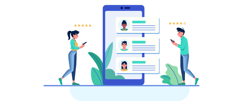
You must have observed a few websites and applications that show a verified buyer tag beside their name when they leave a review.
Absolute examples are Amazon and Flipkart. When we buy a product, we check the ratings and reviews. Plus, we consider ratings that have a verified batch. In fact, if there is a positive review from a non-verified buyer and negative reviews from a varified buyer, we can make better choices.
True testimonials are a great way of seeking your visitor’s attention. It allows them to choose you before any other brand. It is genuine to get a few negative reviews, but the best products and services hardly receive negativity.
You can also have a carousel on the homepage with the best reviews you have received from big companies or clients. That is a strength of any company.
3. Tool Kit
The tool kit is another essential factor to improve website design. It simplifies the user experience, as some concepts could be difficult to understand, or visitors may not have much idea. In that case, you can offer them a tool kit linked to the particular term.
4. Play Cool With Call to Actions

The primary goal of business websites is to generate more conversions. Isn’t it? If the call to action is badly placed, there’s no way you will get expected sales.
Try placing them where they can be easily found and clicked. You can keep them in front of visitors’ eyes, but smartly. You can try a call to action on the top right of the bar, below products under a button, and blog pages where you receive readers.
These calls to action could be different for different landing pages, but they play a vital role. It allows the traffic to easily walk to pages they wish to without complications and confusion.
5. Mobile Friendly
A very critical point is here. By 2025 every single user will browse websites from Mobile Phones. A huge percentage of them already use mobiles to search through their queries and purchases. Especially the voice search results will be more.
Google has already become a question-answer platform. Users search “how to” queries more than ways and tips. So if you want to play well and stick in the game, have a mobile-friendly website.
A lot of websites are not optimized for mobile phones. It leads to a bad user experience and a drop in Google rankings. You must, yourself, take a look at your website from the phone and analyze issues. That will help you offer the best eventually.
6. Table of Contents

If you try to attract more leads through your blog posts, try integrating the table of contents. Some visitors do not want to read it all. They look for specific points. So if your articles have a table of content, they can jump to what they want to read.
It also makes your web design better and easy to scroll. The visitors are very choosy with everything. They will read and implement only what they want and not what we want them to. So make it as simple as you can for them to make the most out of your site.
7. Content Understanding
The content section is one of the crucial Web design tips for beginners. Keep easy-to-understand content. Do not try to write unnecessary catchy write-ups and pic-up lines. It may annoy your visitors.
Include long-form contents and articles that drive traffic to several pages on your website, and link keywords to related content that may provide value to the user.
If your content is clear and easy to read, the users will invest a better time on the page. In fact, try using readable fonts and not fancy. That will attract more readers and allow them to stay on the page for longer.
8. Social Media Integration

Make sure you integrate all your social media profiles as proof of authentic brand. Customers do good research before putting trust into businesses. Plus, let them follow you and check out your posts that may help them.
You can also install a redirection plugin that lets visitors share stuff on your website to their social profiles. Every time you publish an article, the readers can share them through socials. That will also help you reach more leads and traffic.
Wrap Up
There are multiple ways to improve website design, but I believe the above mentioned are essential for 2022. As a beginner, these web design tips will offer you value. They will help you generate more traffic that converts into sales/readers.
User engagement is a very critical term. If you don’t consider, you may not grow well in your business. So, give it a shot and implement what’s needed.


